Nexxen DSP | 2026
Rebuilding Design from foundation to product
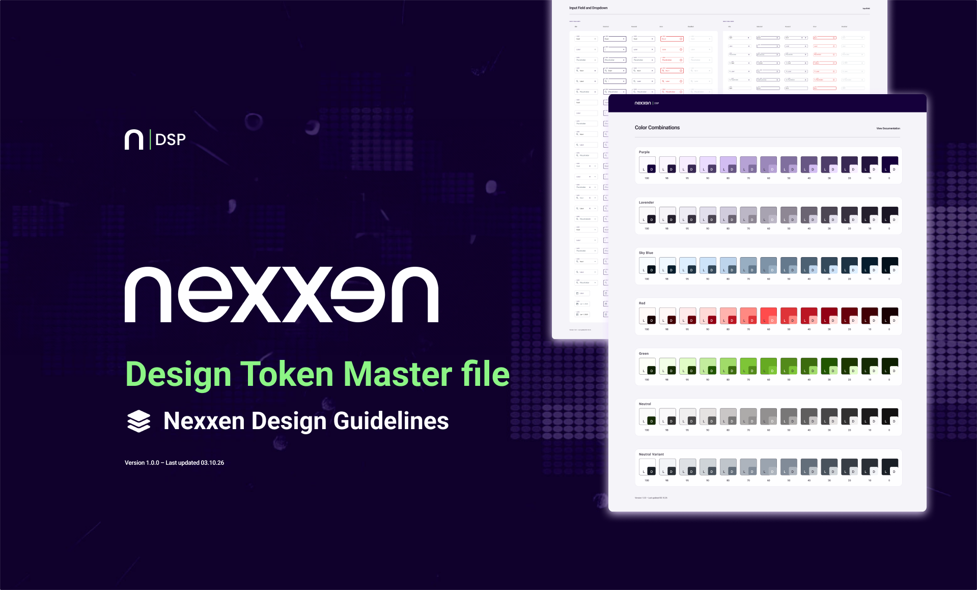
Modularized a legacy design system into a scalable 3-tier Figma token library with 200+ components, consolidating 40+ hardcoded values and enabling rapid dark mode and white-label retheming across platforms.
Role
Lead Product Designer
Scope
Design System, Design Tokens
Platform
Nexxen
Summary
The Problem
40+
Hardcoded color values across the product, with no shared naming, no theming layer, and no ability to propagate brand changes at scale.
The Work
3-tier System
A fully tokenized system built around primitives, semantic roles, and component decisions, documented in Figma with variables prepared for code export.
The Outcome
1 source of truth
A single master file that became the design team's canonical reference, and the foundation for every new component built on the platform.
A platform that outgrew its visual foundation
Nexxen DSP is an enterprise demand-side advertising platform used by media buyers to run campaigns, manage targeting, and review reporting across channels. Like many fast-growing B2B products, it scaled quickly. Designers and engineers made decisions independently which led to inconsistencies in color, spacing, and patterns across the product.
By the time I joined, there was no shared color language, no meaningful type scale, and no clear system for states, surfaces, or elevation. Each new feature inherited whatever came before it.
Something as simple as updating a divider color meant searching through dozens of screens. There was no concept of a reusable interactive blue token, only hex values repeated across the product.
The issue was not just visual inconsistency, it was cost. As the product and team grew, every inconsistency became harder to maintain. We needed a system that both designers and engineers could rely on and one that mapped cleanly to how the codebase consumes design decisions.
My Role
End-to-end ownership of the token architecture
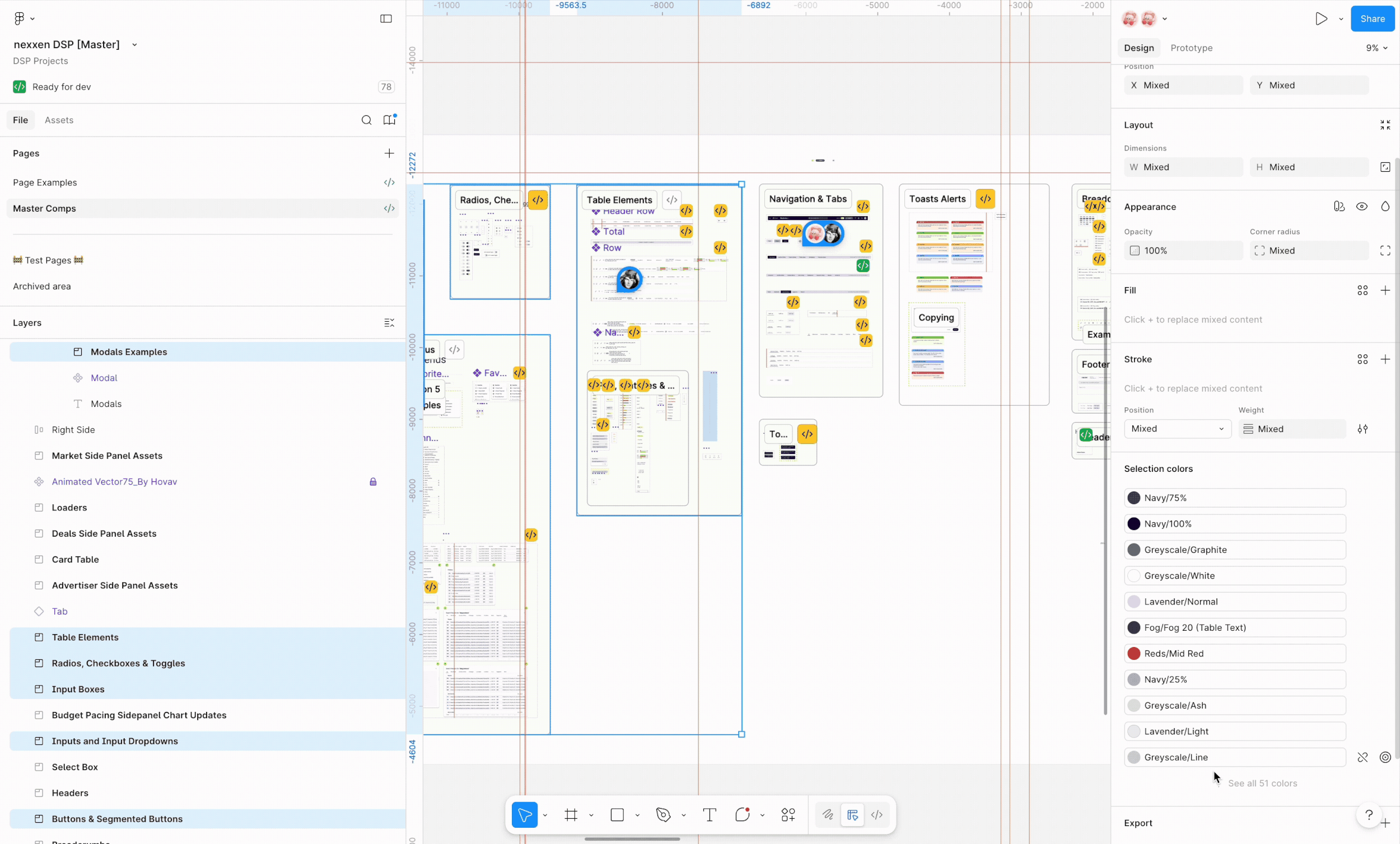
I led the redesign of the design system from audit through implementation-ready documentation. My role covered the full system architecture, including defining color roles, establishing naming conventions, structuring variables, and creating clear documentation for both design and engineering teams.
In close collaboration with front-end engineers, I developed a token structure that translated directly between Figma and code. For example, color.primary.default in Figma aligned with --color-primary in the codebase, creating a shared language across disciplines. The goal was to build a system that was not only visually consistent, but also scalable, maintainable, and easy to implement.
Process
Six stages from audit to handoff
Stage 01
Audit — mapping the existing chaos
I began by cataloguing every color, text style, spacing value, and component state used in the live product. This surfaced the true scope of the problem: over 40 unique color values that could be collapsed into 7 semantic roles, plus type styles with no consistent naming or scale logic.
Stage 02
Primitives — tonal palette architecture
Before defining what any color means, I defined what colors exist. Drawing on Material Design 3's tonal system, I built seven hue ramps, each with 13 stops from 0 (black) to 100 (white). These primitives have no semantic meaning; they are the raw vocabulary from which meaning is composed.
Stage 03
Semantic tokens — naming what things mean
With the palette defined, I mapped specific stops to named roles: primary, on-primary, surface, on-surface, error, and so on. This is the critical indirection layer. It means a theme change touches the semantic token, not every component.
Stage 04
Typography — a named scale with semantic roles
I built a type ramp of 8 sizes (10px to 42px), each with a semantic name tied to its use context. From Metadata Limited for dense table data up to Hero Title for onboarding surfaces.
Stage 05
Graphs, surfaces, and state layers
I defined how data, structure, and interaction are represented across the system. Graphs standardized relationship visualization. Surfaces unified elevation across components to create consistent hierarchy. Semantic layers standardized interaction states as reusable overlays, ensuring consistent behavior across the system.
Stage 06
Versioned documentation and handoff
The master file was structured as living documentation. Each section versioned with a footer component tracking the active spec version. The Figma variable architecture was built to export directly to design token JSON.
The Color System
Seven palettes. One shared grammar.
Each palette is a tonal ramp from pure black (stop 0) to pure white (stop 100), with semantic tokens assigned at specific stops.
Purple Primary — interactive, brand, focus states
Lavender Secondary — supporting actions, tags, secondary UI
Sky Blue Tertiary — informational, data highlights, links
Red Error — destructive actions, validation, critical alerts
Neutral Surfaces, text, borders, backgrounds
Token Structure
3 tiers token structure
Token architecture — three tiers of abstraction
01 · Primitives
purple.40
purple.80
neutral.10
neutral.95
red.40
red.90
→
02 · Semantic
color.primary
color.on-primary
color.surface
color.background
color.error
color.on-error
→
03 · Component
button.bg.default
button.label.default
card.surface
input.bg.default
toast.error.bg
toast.error.text
Typography
A named type ramp — every size has a purpose
Each size in the ramp has a semantic role name that tells designers and engineers not just how big the text is, but where it belongs.
Impact
What the system made possible
The token system wasn't the end of the project — it was the beginning of a new way of working. With a shared vocabulary in place, the design and engineering teams could move faster, with fewer misalignments and a dramatically lower cost of change.
7
Tonal palettes replacing 40+ hardcoded colors across the product
3
Abstraction tiers: primitives, semantic roles, and component decisions
8
Named type roles across a consistent scale tied to UI context
1
Master file used as the canonical source of truth by all designers
0
Hardcoded color values in new components built after system launch
∞
Theme changes now propagate from semantic tokens — touch one, update all
Reflection
What I learned building this from scratch
Naming is half the work
The technical architecture of a token system is learnable. The hard part is the naming — choosing words that make sense to a designer in Figma and an engineer reading CSS. Getting both teams in the same room early saved weeks of rework.
Three-tier abstraction is non-negotiable
Systems that skip the semantic layer — going directly from raw values to components — collapse under the weight of any brand or theme change. The indirection layer is what makes the system genuinely scalable.
Documentation is a product deliverable
The Figma file wasn't complete when the components were built — it was complete when a new designer could onboard to the system without asking anyone for help.
The audit is the brief
The most valuable thing I did at the start wasn't writing a design brief — it was cataloguing every hardcoded value in the product. The audit revealed the true shape of the problem.
Design systems work is invisible when it's working. The sign of success isn't when designers praise the library — it's when engineers stop asking designers to clarify what a color means.